In our digital age, the screens of computers and mobile devices have become our modern-day canvases. On these screens, text—a fundamental element of human communication—needs to be as clear, crisp, and legible as possible. Microsoft, in its quest for improved digital user experience, developed a solution known as ClearType. In this article, we simplify the workings of this technology, putting it within easy grasp for college students and budding tech enthusiasts.
The world of digital typography can seem complex, but it doesn’t have to be. From explaining the concept of ClearType to exploring how it improves on-screen reading, we aim to present a comprehensive yet straightforward guide to this Microsoft innovation. Whether you’re an avid digital reader, a graphic designer in the making, or simply someone who spends a significant amount of time in front of a screen, understanding ClearType can improve your digital experience.
In this article:
- What is ClearType Technology?
- The Science Behind ClearType: Subpixel Rendering Explained
- How to Enable and Tune ClearType in Windows
What is ClearType Technology?
Microsoft’s ClearType technology is a software-based enhancement designed to improve how text looks on LCD (Liquid Crystal Display) and LED (Light Emitting Diodes) screens, which are found in most modern displays. At its core, ClearType works by manipulating pixels to make the edges of text characters appear smoother and more defined.
In a non-technical nutshell, you can think of ClearType as a clever artist. Traditional digital text rendering can sometimes make text appear jagged or blurry—this is where our artist steps in. ClearType adjusts the text, adding fine touches here and there so that the end result is a piece of text that’s easier to read and pleasing to the eye. This becomes particularly valuable for lengthy digital reading sessions, where clear text can reduce eye strain.
The Science Behind ClearType: Subpixel Rendering Explained
To comprehend the workings of Microsoft’s ClearType technology, we must first understand the composition of the pixels that construct our digital displays. A pixel, the smallest unit of a digital display, is composed of three subpixels: red, green, and blue (RGB). Traditionally, rendering systems treat this trio as a single unit when displaying text or images. This conventional approach is known as “whole-pixel rendering.”
Here’s where ClearType introduces a paradigm shift. Instead of treating a pixel as a single entity, ClearType uses a technique known as “subpixel rendering.” In essence, it manipulates each of the three subpixels independently. This innovative strategy effectively triples the horizontal resolution, resulting in more detailed and sharper text.
Picture an artist given the task of painting a figure, but instead of using broad strokes, they now have a finer brush that allows more precise detailing. This is analogous to what ClearType does. By addressing each subpixel individually, it can adjust the intensity of each color component to create smoother transitions and less jagged edges in text characters.
The standard RGB
However, the effectiveness of ClearType’s subpixel rendering hinges on a key assumption: the arrangement and color order of the subpixels. ClearType is designed with the standard RGB layout in mind, where the subpixels in each pixel are arranged in a specific order: red on the left, green in the middle, and blue on the right.
While this RGB structure is standard in most displays, it’s not universal. Some devices use different arrangements or color orders, and in these cases, ClearType’s subpixel rendering might not work as effectively. Nevertheless, for the vast majority of LCD and LED screens, ClearType provides a significant improvement in text clarity and readability.
In conclusion, the science behind ClearType’s enhanced text rendering lies in its innovative use of subpixel rendering. By diving deeper into the pixel structure and making use of each color component individually, ClearType delivers text that is smoother, sharper, and easier on the eyes.
How to Enable and Tune ClearType in Windows
Whether you’ve been working with Windows for years or you’re just getting started, the process of enabling and tuning ClearType is straightforward and user-friendly. It’s all managed through the ClearType Text Tuner, a utility built into Windows.
Here’s a step-by-step guide:
- Begin by opening your Windows Control Panel. You can do this by typing “Control Panel” into the search bar on your taskbar and clicking on the app that appears in the search results.
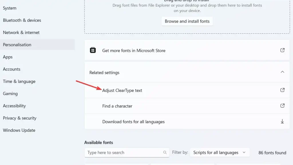
- Once in the Control Panel, navigate to “Appearance and Personalization.” Click on it, and you’ll find the “Display” option. Under Display, you’ll see the “Adjust ClearType text” link. Click this link to launch the ClearType Text Tuner.
- When the ClearType Text Tuner window opens, make sure that “Turn on ClearType” is checked. Click on the “Next” button to proceed.
- You’ll be guided through a series of screens displaying text samples. For each screen, pick the text that looks best to you. ClearType’s goal is to improve text readability according to your specific screen and your personal preferences, so there’s no right or wrong choice here. Simply pick what’s most visually pleasing to you.
- Once you’ve gone through all the screens, click on the “Finish” button to apply your settings. ClearType is now enabled and tuned to your preference.
Note that your ClearType settings apply to all users on the computer, so if the device is shared, be sure to consider the preferences of others as well. If you ever want to readjust your ClearType settings, you can simply return to the ClearType Text Tuner and repeat the process.
ClearType is a versatile tool designed to enhance your on-screen reading experience. By taking a few moments to enable and tune ClearType, you can enjoy crisper, clearer text that’s tailored to your screen and your eyes.